If minimalist decor has left you cold and Japandi-style serenity feels more sterile than soothing, you’re not alone. The era of restraint is making way for riotous expression as maximalism stages a bold return. Homeowners and designers alike are embracing curated chaos and a vibrant burst of individuality—and colour is leading the charge.
Maximalist design, which began gathering momentum in 2024, is continuing its colourful crescendo into 2025. According to Pinterest’s trend forecast, eclectic interiors and intentional “clustering” are gaining major traction, proving once and for all that more is, indeed, more.
The heart of maximalism lies in abundance—generous displays of personal treasures, layered textures, and a fearless use of colour. This décor style feels like a warm hug, where every item tells a story and every corner hums with character.
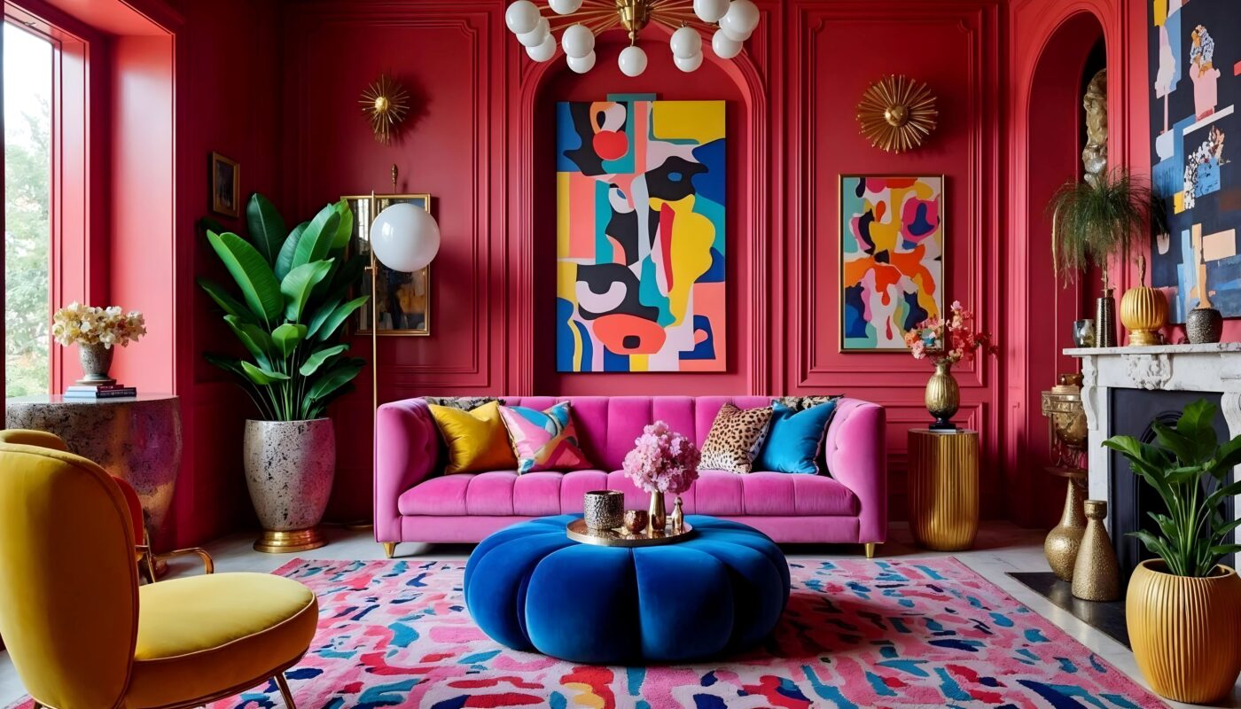
Gone are the greys and off-whites of minimalist palettes. In their place: saturated tones that flood a space with energy and depth. Rich hues not only define the space—they create cohesion across diverse textures and patterns.

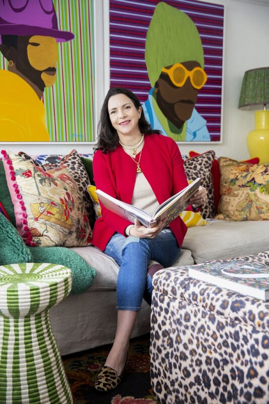
Colour can elevate a space from clean-lined to quirky just by juxtaposing layers that complement or amplify each other,” says Sarah Ord, South African interior designer known for her exuberant colour storytelling in high-end projects from the Eastern Cape to Tanzania. Her recent refresh of Cape Cadogan Boutique Hotel in Cape Town is a testament to her signature flair.
Ord’s passion for colour runs deep: “When I had a retail store, we painted the entire facade in Plascon Burnt Horizon R7-B1-1—it shouted that we had arrived! With a giant turquoise pot and hot-pink bougainvillea at the entrance, it was joy in 3D. I miss that space every day.”
Her personal palette over the years has included ruby red, sea-green, ochre, and coral. Her current obsession? Plascon Millionaire Gold Y2-B1-1. “It’s a sunflower-yellow nest of happiness,” she says of her plan to repaint her sunroom.
Cape Town-based décor stylist and former magazine editor Genneth Lyn agrees that colour should always be context-driven. “I look at architectural style, decorative elements, how the space is used, and then I select colours that connect with key accent pieces.” Her tip? Always test. “Paint swatches behave differently depending on lighting, surface and finish. I live with the tester colours—day and night, sunny and cloudy—before I commit.”
Plascon colour expert Patty Mulauzi describes maximalism as “an unapologetic embrace of colour, pattern, and texture. It’s about letting opposites attract, and allowing clashing hues to harmonise beautifully. Colour isn’t just decorative—it’s the heartbeat of the space.”

Here’s how Mulauzi recommends using colour to craft emotional impact in your space:
- For Depth & Drama:
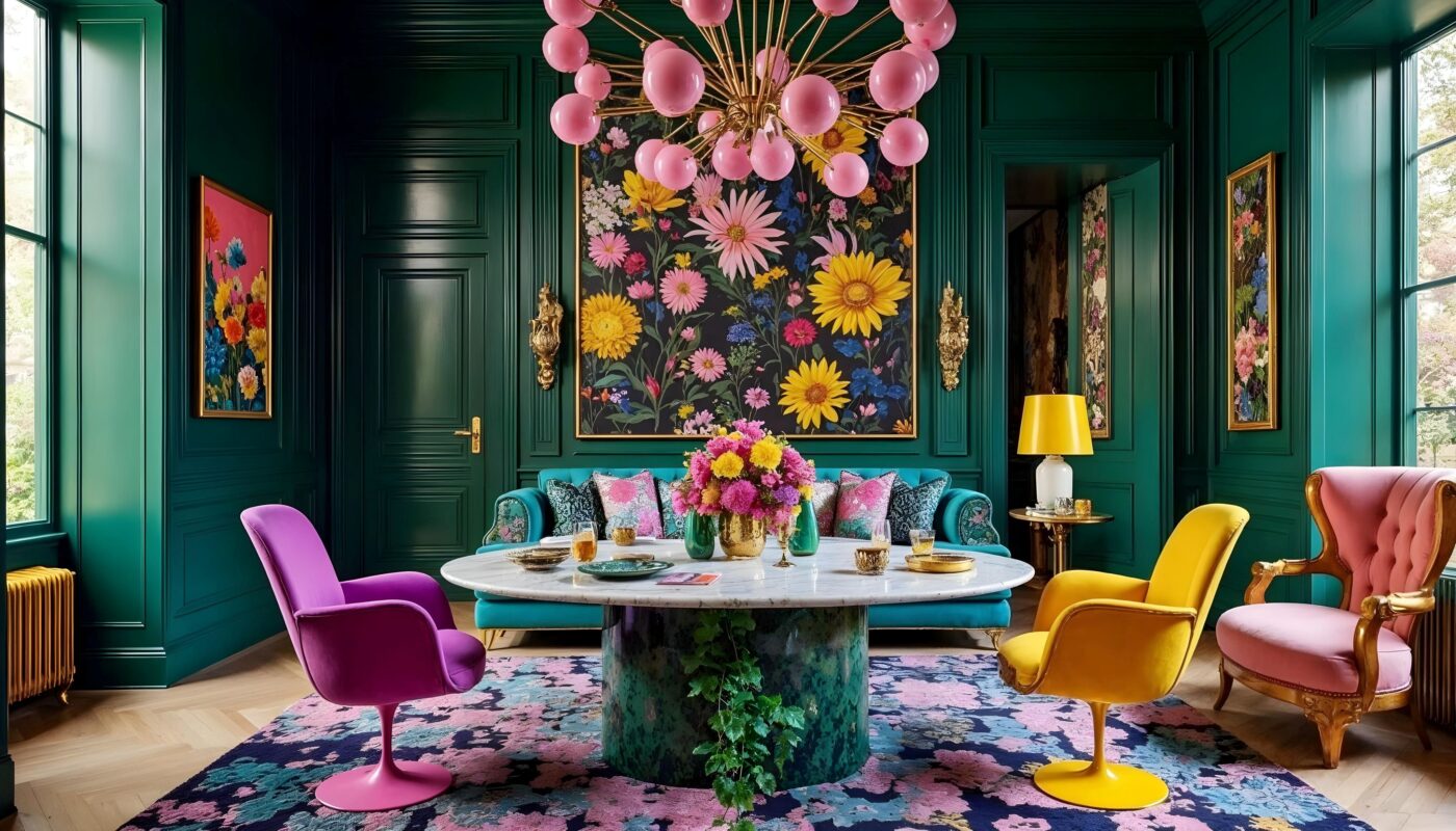
Deep teals like Plascon Headwaters G5-B1-2 or emeralds like Plascon Jungle Book G5-C1-1 add richness and contrast.
“These hues ground the space while allowing vibrant accents to pop,” says Mulauzi. - For Energy & Playfulness:
Sunny tones like Plascon Crazy Daisy Y4-A1-1 or bold pinks like Fuschia Fizz R2-A1-1 spark instant joy.
“They energise a room and uplift the mood—it’s colour therapy at its best.” - For Warmth & Grounding:
Earthy shades like Plascon Free State Earth O1-C1-2 or burnt orange Freckle O3-C1-2 bring balance.
“These tones anchor visual excess with a comforting, tactile quality.” - For Unexpected Contrast:
Pair Plascon Saphire B7-A1-1 with zesty yellows like Tuscan Wall Y1-B1-2 or corals like Adobe Desert R6-B1-2.
“Unexpected combinations keep the eye moving and the soul engaged,” she adds.
Maximalism encourages bold, expressive, and deeply personal design. So go ahead—drape that patterned throw, stack those colourful books, hang those gallery walls. Let your home tell your story, one joyful layer at a time.
Is your space ready to drench itself in colour?
For more inspiration and the full Plascon colour range, visit: www.plascon.co.za


